Introduction
CSS provides various techniques to control the layout and positioning of elements on a webpage. Understanding these techniques is essential for creating responsive and well-structured web designs. In this article, we’ll explore different CSS layout methods such as Flexbox, Grid, and positioning properties.
CSS Display Property
The display property defines how an element is displayed on the page.
Common Display Values:
div {
    display: block; /* Default for div */
}
span {
    display: inline; /* Default for span */
}
.flex-container {
    display: flex; /* Enables Flexbox */
}
CSS Positioning
CSS provides different positioning methods to control the placement of elements.
Static (Default)
Elements appear in the normal document flow.
div {
    position: static;
}
Relative
Positioned relative to its normal position.
div {
    position: relative;
    top: 20px;
    left: 10px;
}
Absolute
Positioned relative to its nearest positioned (non-static) ancestor.
div {
    position: absolute;
    top: 50px;
    right: 30px;
}
Fixed
Positioned relative to the viewport (does not move when scrolling).
header {
    position: fixed;
    top: 0;
    width: 100%;
    background-color: blue;
}
CSS Flexbox
Flexbox is a layout model that arranges elements dynamically within a container.
Example:
.flex-container {
    display: flex;
    justify-content: space-between;
    align-items: center;
}

<div class="flex-container">
    <div>Box 1</div>
    <div>Box 2</div>
    <div>Box 3</div>
</div>
CSS Grid
CSS Grid is a two-dimensional layout system that provides precise control over rows and columns.
Example:
.grid-container {
    display: grid;
    grid-template-columns: 1fr 1fr 1fr;
    gap: 10px;
}

<div class="grid-container">
    <div>Item 1</div>
    <div>Item 2</div>
    <div>Item 3</div>
</div>
Float and Clear
Before Flexbox and Grid, float was commonly used for layouts.
Example:
.image {
    float: left;
    margin-right: 10px;
}
.clearfix::after {
    content: "";
    display: block;
    clear: both;
}
Conclusion
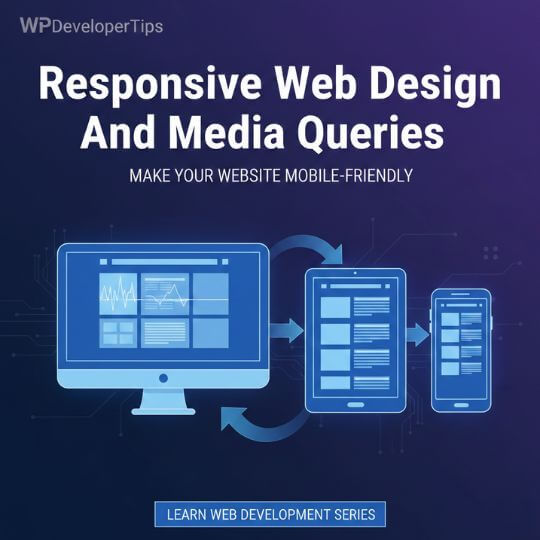
Understanding CSS layout techniques is essential for building structured and responsive web designs. Flexbox and Grid provide powerful tools for modern layouts, while traditional positioning techniques remain useful in various cases. In the next article, we’ll explore Responsive Web Design and Media Queries.

