Introduction
With the increasing use of mobile devices, it’s essential to build websites that look great on all screen sizes. Responsive web design ensures your site adapts to different devices. In this article, we’ll explore how to make your website responsive using CSS media queries and other best practices.
What is Responsive Web Design?
Responsive Web Design (RWD) is an approach that allows web pages to adjust their layout and appearance based on the device’s screen size, resolution, and orientation.
Why Responsive Design is Important
- Improves user experience on all devices
- Boosts SEO rankings (Google prefers mobile-friendly sites)
- Reduces bounce rates
- Easier maintenance (one website for all devices)
Viewport Meta Tag
Add the following tag inside the <head> of your HTML to control layout on mobile browsers:
<meta name="viewport" content="width=device-width, initial-scale=1.0">Media Queries
Media queries apply CSS styles based on screen properties such as width, height, and resolution.
Basic Syntax:
@media (max-width: 768px) {
    body {
        font-size: 14px;
    }
}
Common Breakpoints:
/* Small Devices (Phones) */
@media (max-width: 576px) {
    .container {
        padding: 10px;
    }
}

/* Medium Devices (Tablets) */
@media (max-width: 768px) {
    .container {
        padding: 20px;
    }
}

/* Large Devices (Desktops) */
@media (max-width: 992px) {
    .container {
        padding: 30px;
    }
}
Responsive Layout Techniques
1. Percentage-based Widths
Use relative units instead of fixed widths.
.container {
    width: 100%;
    max-width: 1200px;
    margin: 0 auto;
}
2. Flexible Images
Ensure images scale within their containers.
img {
    max-width: 100%;
    height: auto;
}
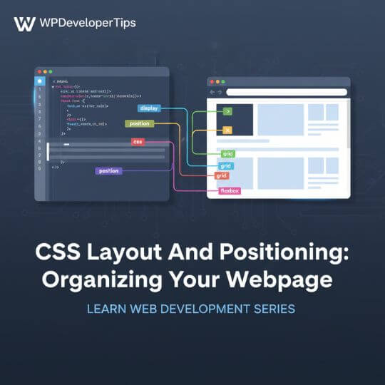
3. CSS Flexbox & Grid
Use modern layout systems like Flexbox and Grid to create adaptable designs.
Tools to Test Responsiveness
- Google Chrome DevTools (Device Toolbar)
- Responsively App
- BrowserStack or LambdaTest
Conclusion
Responsive web design ensures your site works smoothly on all screen sizes, enhancing user experience and SEO. By using media queries, flexible layouts, and proper testing tools, you can build websites that are both beautiful and functional. Next up, we’ll dive into JavaScript Basics for Interactivity.

